Decorating with Gray
Guide for Choosing the Right Colors
1/4 Using Gray Color on Walls
2/4 Using Gray Color on Furniture
3/4 Using Gray Accessories
4/4 Using Gray Color in Professional Spaces
Gray is the symbol for security, maturity and dependability.
People who favor gray are usually the lone wolf type, responsible, conservative and practical.
In interior decoration gray is the new white.
Gray is the true neutral color.
Its energy imparts void, emptiness, lack of movement, emotion, warmth and identifying characteristics.
Because of this, gray can be restful. It has a detached and isolated feeling.
1. Gray Color on Walls
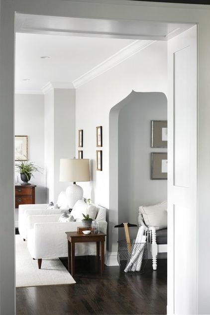
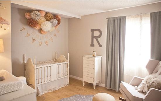
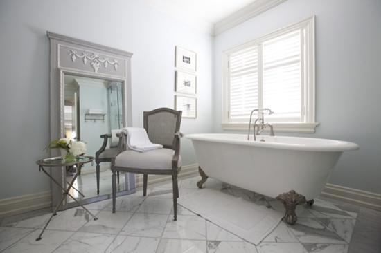
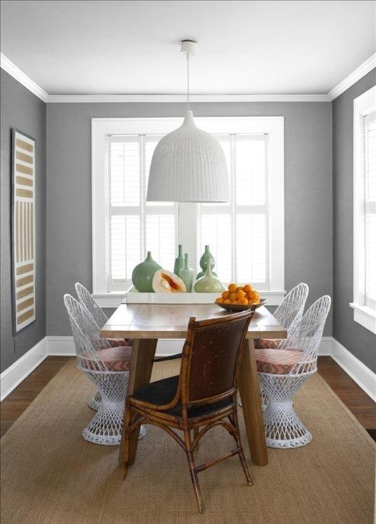
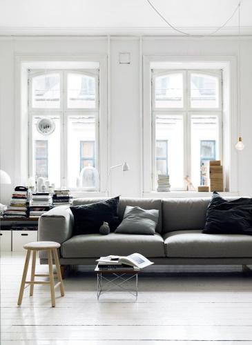
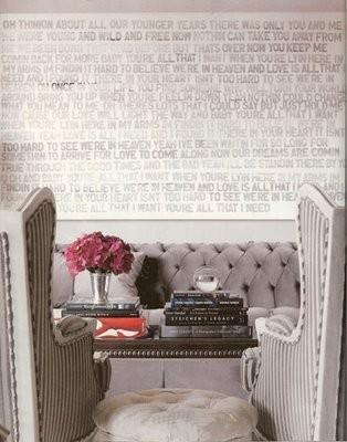
Light gray shades on walls are soothing and calming, and they match almost with any decorating style.
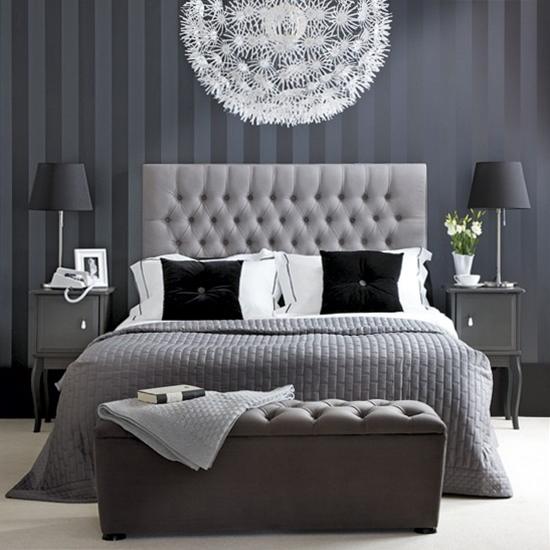
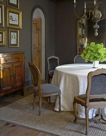
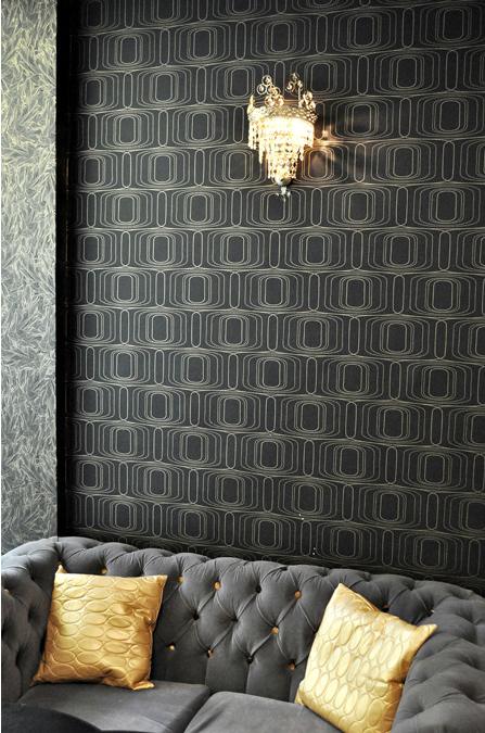
The closer gray gets to black, the more dramatic and mysterious it becomes.
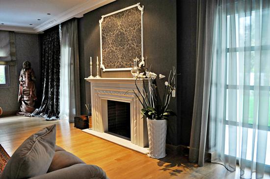
Dark gray on walls is conventional, serious and solemn, inflexible and strict.
That makes it ideal choice for classic and rustic decorating style.
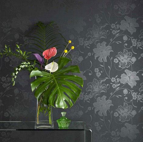
Of course you can also use wall coverings to add gray color on your walls.
I adore shades of gray! Gray color can sure bring style and beautiful feng shui energy to any space, as long as you choose wisely.
Remember that Feng shui areas that most benefit from color gray are West (Creativity), Northwest (Helpful People) and North (Career).
2. Gray Color on Furniture
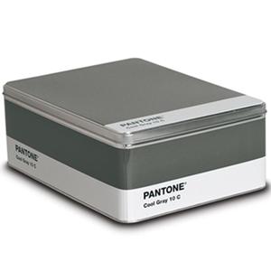
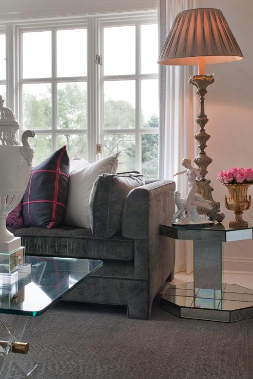
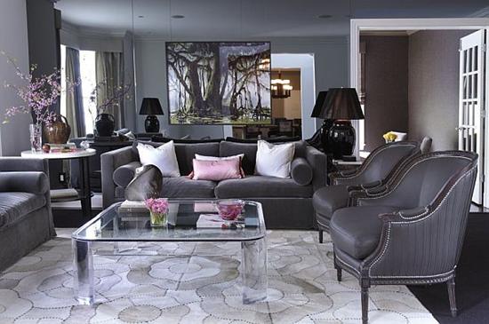
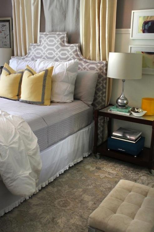
Gray color is the most elegant neutral we can use on furniture. It gives depth to subtle colors and makes bold tones pop.
3. Gray Color Accessories
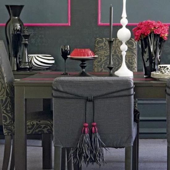
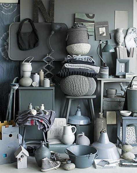
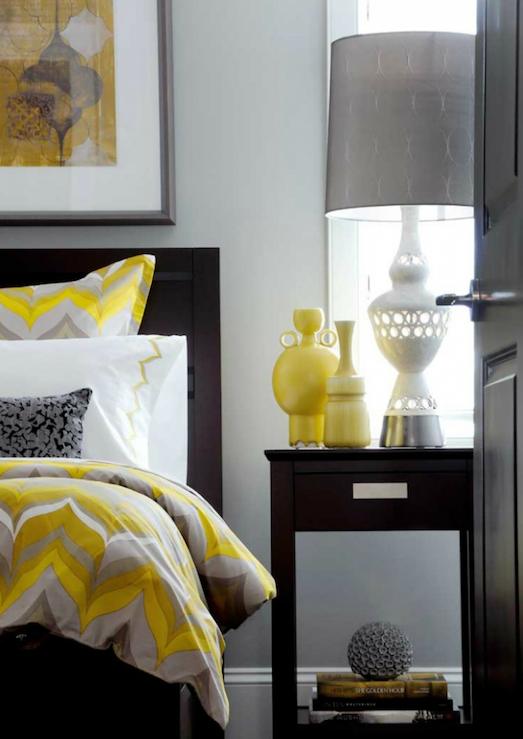
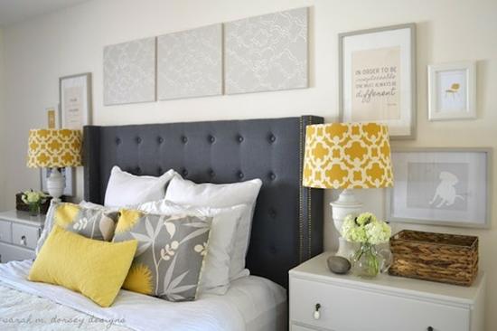
Gray color accessories can have a cooling effect when placed next to other more vibrant colors.
It has a stabilizing effect, making vibrant colors stand out while muting their vibration.
4. Using Gray in Professional Spaces
Gray is a safe color to use in many business applications.
It is neutral and serious and can be combined with almost any other color to impart different messages and to reach different target markets.
Here I used it on walls in a hair saloon project.
Here I used it on furniture in a bar’s project
Surprisingly, gold can work well with gray to suggest professional and high quality, but on a website the gold will tend to look like a dirty yellow which is not positive.
Gray is suitable for legal and financial websites to suggest power and control, particularly when combined with some white and black.
Combining it with blue suggests credibility, trust and reliability.
Light gray can create a hi-tech look when combined with other colors such as turquoise, light blue, dark blue or yellow.
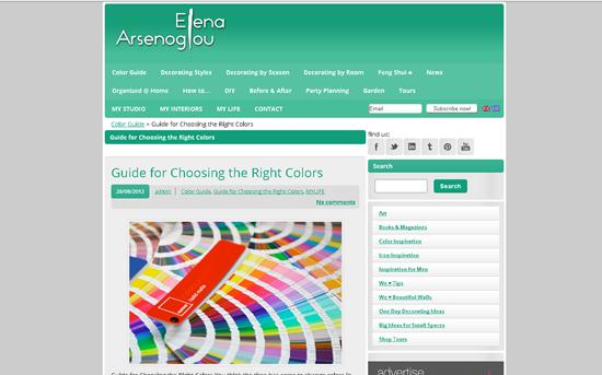
I used gray colors for the redesign of my decoration blog. I wanted a neutral, serene effect but also a color to support my favorite bold emerald green.
Now you know how to choose the right hues!
Cool or warm shades of gray for you?


 Ελληνικά














ΕΙΝΑΙ ΠΟΛΥ ΚΑΛΗ